The Oracle Design System
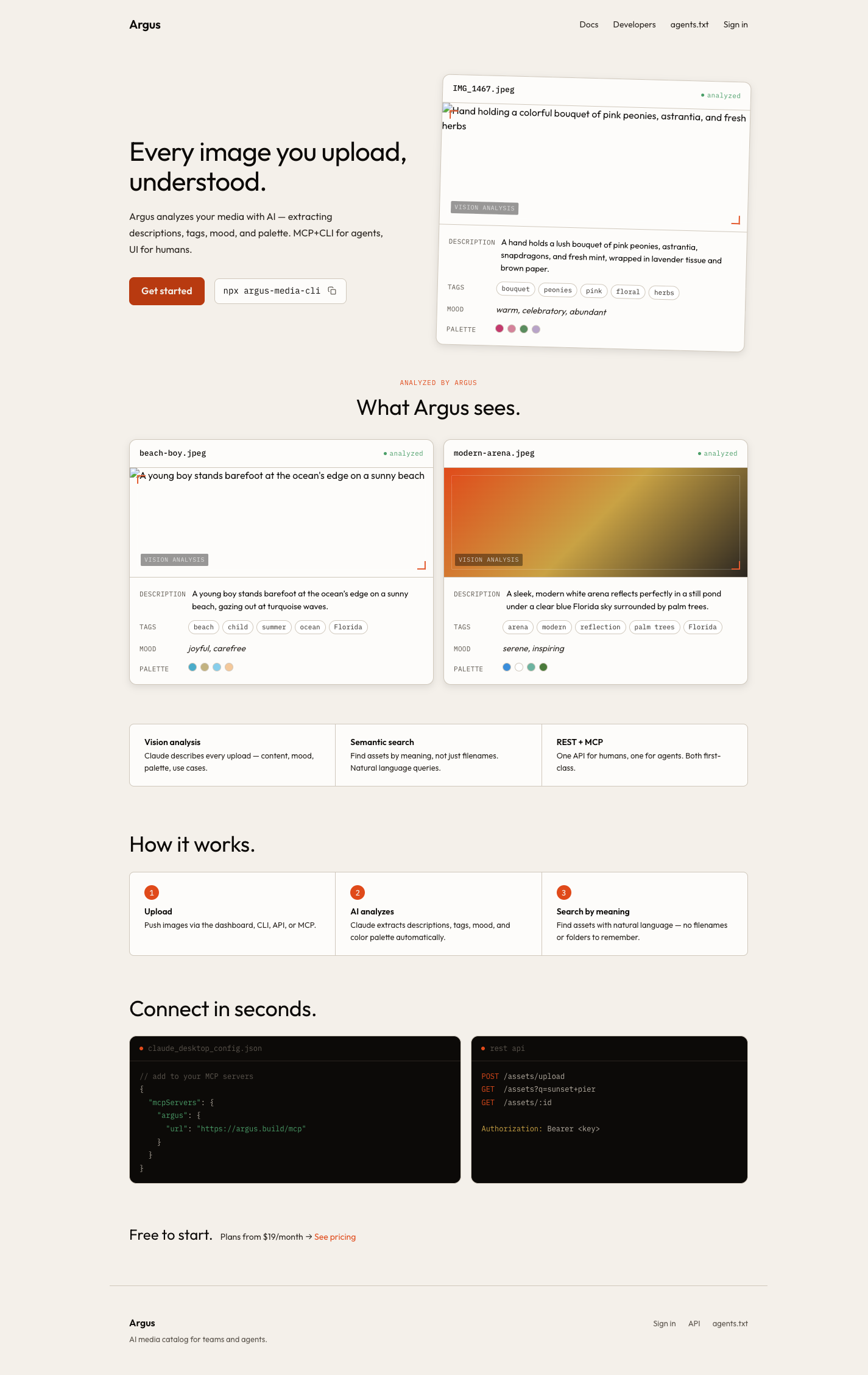
The Design Problem
Argus had a working product. Users could upload images, run AI analysis, and manage workspaces. What it didn’t have was a visual language — just well-built UI with no point of view.
The product’s name is Argus: the hundred-eyed giant of Greek mythology, a guardian who sees everything. A brand with “eye” at its center doesn’t need a generic SaaS aesthetic. It needs to look like itself.
Oracle Design was the answer. The name matters: a named system creates a shared vocabulary. When everything refers back to one origin, the decisions hold together.
Designed from the Eye Up
The most specific decision was the icon system. Icons in most SaaS tools are borrowed from shared libraries — abstract enough to mean anything, distinctive enough to mean nothing in particular. Oracle’s icons are derived from the eye form: circular containment, radiating structure, iris-like geometry. They read as a family because they share a root.
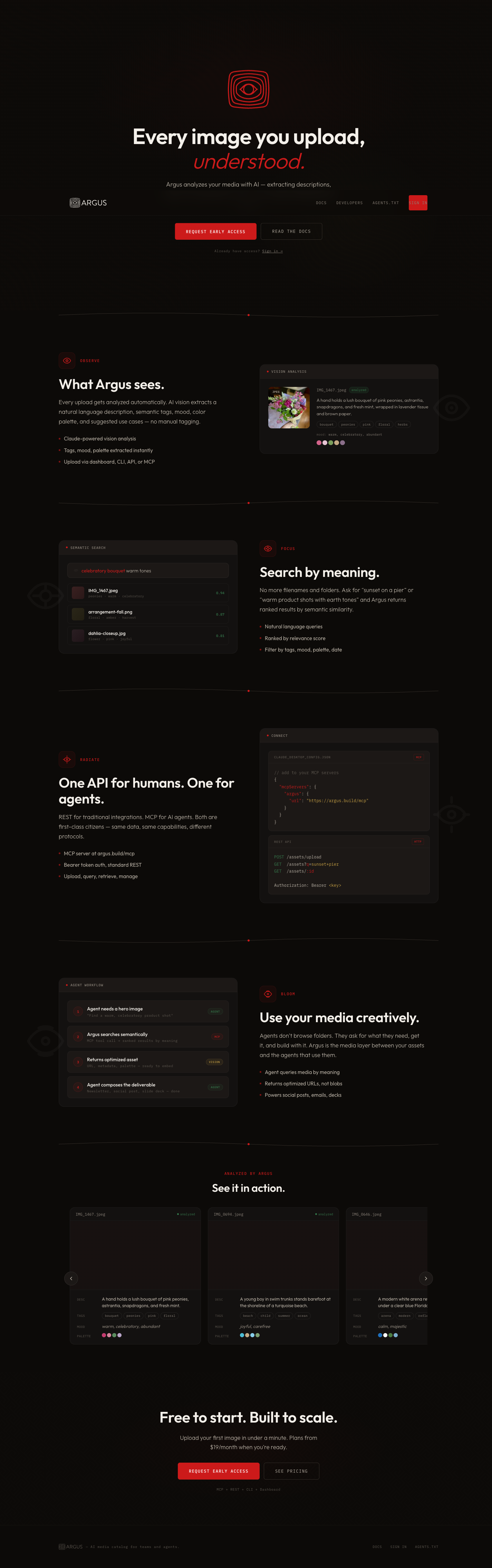
Color followed the same logic. The palette isn’t “dark with an accent” — it’s a specific dark that recedes, and a specific light that calls attention. The eye motif demanded high contrast without harsh edges: rich blacks, warm off-whites, a restrained use of color that lets the eye form carry the brand weight.
The type choice was a revision, and the revision was correct. The original spec called for a serif — legible, respectable, slightly editorial. Mid-sprint, the founder changed direction: swap to Outfit, a variable geometric sans. Outfit’s circular letterforms echo the eye geometry without announcing it. The revision was absorbed without reopening prior work, and the result is more coherent than the original spec.
Before and After
The transformation is most visible side by side. Same application, same information architecture, same code. Different point of view.
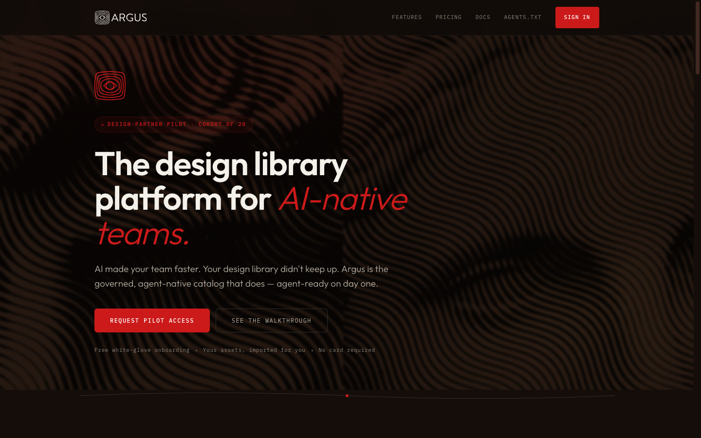
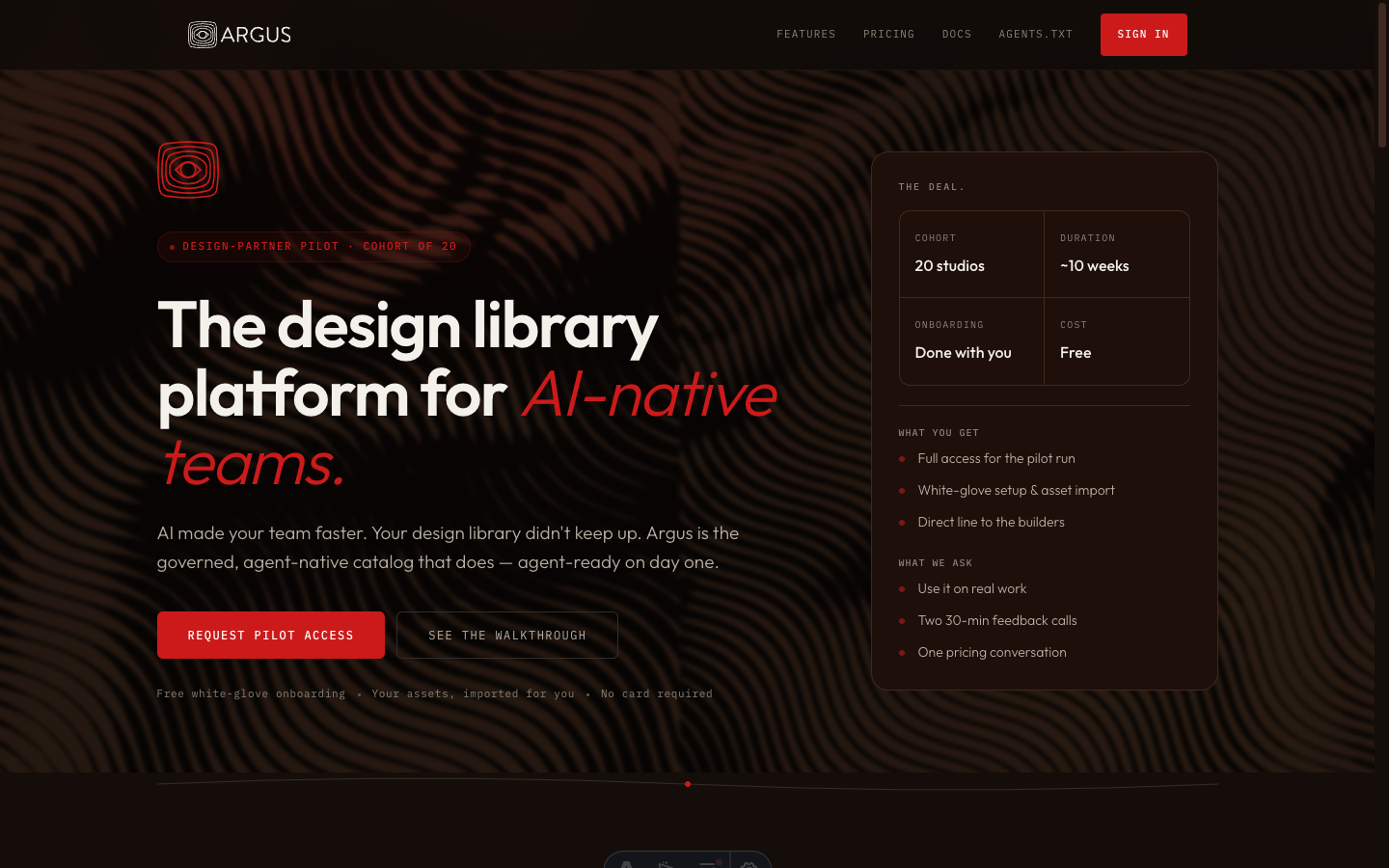
The difference isn’t decoration. The before state is a capable product that doesn’t know what it is. The after state is the same product, having made its mind up.
The Applied System
Oracle shipped across six pages and seven component categories. The media library — the product’s core view — shows the design most fully: the icon system, typographic hierarchy, and spatial rhythm all visible in a single screen.
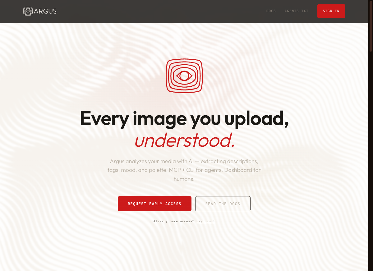
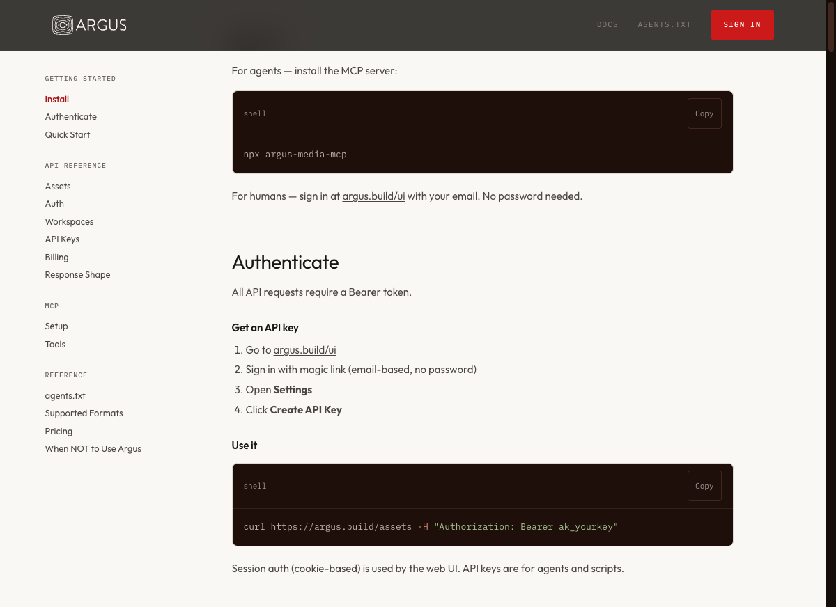
The system is responsive. Mobile isn’t a fallback — it’s the same visual language at a different density.

The implementation covered the full application: design tokens, component library (buttons, cards, modals, tables, forms), WCAG AA accessibility audit, and a light-mode variant. Two bugs surfaced mid-sprint and were fixed within the sprint window.
Process
| Layer | Scope |
|---|---|
| Foundation | Design tokens, base styles |
| Components | 7 categories: buttons, cards, alerts, modals, tables, forms, icons |
| Icon system | Eye-derived SVG set, original |
| Pages | 6 redesigned: login, media library, settings, landing, docs, upload |
| Quality | WCAG AA audit, light-mode variant |
| Cycle time | 2 days (2026-03-31 to 2026-04-02) |
Design systems are typically multi-week projects: naming, speccing, stakeholder alignment, then page-by-page application. Oracle went from spec to production-applied in two days.
Speed was the result, not the goal. A named system with a clear point of origin — the eye — made every downstream decision faster. When a new icon needs to fit, the question answers itself. When a color decision is uncertain, the motif decides. A design system’s real value isn’t consistency as a rule; it’s consistency as a consequence of having a real idea.